How I learned to stop worrying and love the Palma v.2
 Source: Oxfam
Far from being a dry, technical exercise, the choice of an inequality indicator can be a highly political and ideological decision.
This blog was co-authored by Alice Krozer, Visiting Researcher Center on Poverty and Inequality at the University of Stanford, and PhD Candidate at the University of Cambridge’s Centre on Development Studies
Admittedly, inequality indicators may induce sleepiness. Names like the Gini coefficient, the Theil index, the Palma ratio, the Lorenz curve don’t inspire much excitement as party conversation starters.
Despite lacking glamor, the indicator you choose to measure economic inequality matters greatly.
This is because inequality looks different depending on how it’s measured. And indicators can be thought of as alternative lenses for examining inequality.
For these reasons, it’s easy to see how politicians, or researchers, or campaigners, may want to rely on indicators that suit their interests. For instance, some inequality indicators are better at masking extreme wealth among the richest. Other measures, by contrast, omit middle income groups and focus exclusively on comparing the rich to the poor.
Many indicators are not particularly transparent about their focus either. So when using a “default” measure, you might not even realize which part of inequality you are viewing, or the measure’s particular bias.
The Gini
The most famous indicator is the Gini coefficient. This is a number ranging from perfect equality, where everybody has the same income (0.0), to perfect inequality – meaning all income is possessed by a single person (1.0). The Gini is calculated from what’s called a Lorenz curve, which lines up all individuals according to their income to show the cumulative share of people at a certain income level. Figure 1 below offers an example.
Figure 1
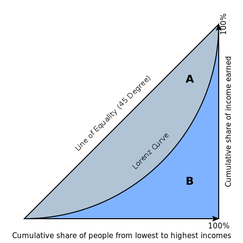
Since describing a country’s inequality from a Lorenz curve can be complicated, we generate a Gini coefficient from this data. Calculating a Gini produces a nice, single number to describe the level of inequality. So, instead of saying “X% of the country holds Y% of the income,” we can simply say, “The US has a Gini coefficient of .40.”
While the Gini delivers a convenient single number expressing inequality, it’s far from perfect.
First, the number alone doesn’t tell us much. Does a Gini of .40 suggest inequality is high, medium, or low? There are no objective standards. Instead, you can only make inferences by comparing to other countries, or trends over time.
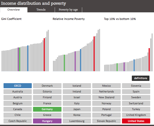
Second, two countries can have the same Gini without having the same overall distribution. For instance, Germany and Hungary both have a Gini of .29. However, relative income poverty and the ratio between top and bottom earners is higher in Hungary. Alas, it’s hard to say these countries are equally unequal.
Figure 2
Why does this happen? Because the Gini is less good at capturing inequality at the top and the bottom of the income distribution (or, the “tails”). Instead, it’s a bit overly sensitive to what’s happening in the middle.
Often, this isn’t a problem. For instance, we may want to know more about how middle income groups have fared over a number of years. The Gini is a great way to understand whether they are gaining more or less of the national income pie.
The Palma approach
There is a compelling reason for why we may want to ditch the Gini for a different lens on inequality.
Namely, for most countries, inequality isn’t driven so much by what’s happening to middle income groups. Instead, inequality results from a tug-of-war between the richest and poorest.
Across most countries, we see a regular pattern whereby about half of national income is captured by the 50 percent of the population situated between percentiles 40 and 90. The other half of national income is up for grabs between the richest 10 percent and the poorest 40 percent.
Since the Gini is over sensitive to the middle, and under sensitive to the tails, it underestimates the extent of inequality for most countries today.
The Palma measure permits us to look at national level inequality in a way that recognizes this regularity. How so? The Palma completely eliminates the middle groups from its calculation and instead assesses inequality as a ratio between the income share held by the richest 10 percent and the poorest 40 percent.
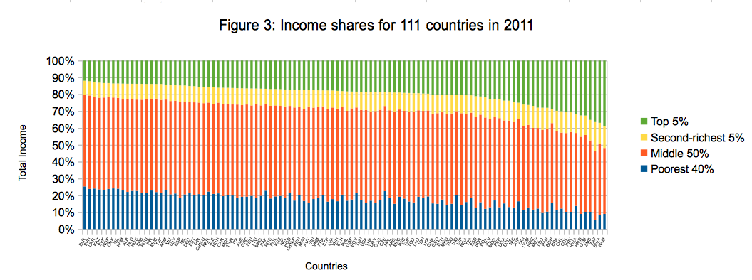
Of course, you can calibrate this ratio approach. For instance, what we’re calling the Palma v.2 compares the richest 5 percent to the poorest 40 percent. This is an especially powerful way to gauge how well the very richest are faring against the poor. Figure 3 below aligns 111 countries according to the income share their richest 5 percent holds. The more we move to the right side of the graph, the larger becomes the share of the richest, the smaller that of the poorest, and hence the more unequal the countries.
Different indicators can even point to opposing trends: for instance, according to the Gini coefficient as calculated by the World Bank, in the 2000s inequality in Mexico fell. However, other studies find increases in top ten percent’s income shares over the same period and top five percent’s share respectively, which would instead indicate increasing inequality.
Measures remain imperfect
All these indicators have their blind spots. If the Gini “ignores” the tails, the Palma brackets the middle – which can be equally problematic if empirical patterns were to change significantly over time, as Milanovic cautions.
Indeed, no summary measure, whether the Gini, Palma, Palma v.2 or others, is in and of itself enough to fully describe the complexities of income distributions and their various internal dynamics. Instead of relying one a single number, we should select the appropriate indicator(s) depending on the question we want to answer.
This will allow us to identify more suitable policy responses; and in turn, might finally bring us closer to more acceptable levels of inequalities.