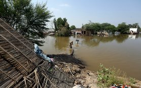
[ PART OF A SERIES ON OUR CHANGING CLIMATE ] | Disruptions in our climate—whether gradual or precipitous—strike the most severe blows on vulnerable populations. Here, we have a shocking illustration of just how much the climate is heating up.
Temperature records have been set all over the world this year. On the West Coast of North America, records were broken across California, Oregon, Washington, and British Columbia. Sicily broke Europe’s record high temperature (at 120ºF), and satellites measured ground temperatures in the Siberian Arctic of 118ºF.
Possibly most concerning is that this July was the second hottest month on record, despite the influence of a La Niña event, which usually exerts a cooling effect on global temperatures. (Most high-temperature record-setting years have been under the influence of El Niño events.)
While this spate of records is disquieting, it can still be hard to get an overall picture of the crisis based on individual record-setting events. To address that, I built a data visualization that shows what happened in terms of annual temperature records, globally, between 1851 and 2021. The result is alarming, though perhaps not surprising.

Each dot on the map reflects a year when an annual average temperature record was broken. Red dots indicate high-temperature records, and blue dots indicate low-temperature records. The intensity of the color reflects the magnitude of the change. The bottom visualization tallies the cumulative records for high and low temperatures (counting every time a record gets set at any location).
We see that cold records dominate the initial period, and then see a recent, rapid uptick in high-temperature records. Specifically, cumulative high-temperature records exceed cumulative low-temperature records after 1987 and, most strikingly, no low-temperature records are set anywhere after 2012. (Because this is based on annual averages, individual cold events could get lost; see notes at the end.)
The Arctic and Antarctic show the greatest temperature jumps, which reflects the extremely rapid warming that has been taking place in these regions.
What this means for human populations
In the short term, this alarming trend of increasing heat exposure will do more than simply create a few more uncomfortable days every year. Direct heat exposure threatens lives. According to the EPA, between 1979 and 2018, 11,000 Americans died from heat-related causes (though the number could be closer to double that when counting heat as a “contributing factor” to death). Those most vulnerable include the elderly, people with chronic health problems, and the young.
The impacts of increasing heat stress as the planet warms are difficult to assess. We have high confidence that the number of deaths from heat exposure will increase, though by how much is hard to determine: studies tend to be specific to their demography (making generalizations challenging), epidemiological data are biased by their focus on a small number of large cities, and historic measurements have changed (meaning that comparisons between periods can be difficult).
What we can be much more certain of, however, is that the core injustice of climate change will remain: the poorest and most marginalized populations—those who have done least to cause the problem—will be most exposed to its impacts. Specifically, the risk of extreme heat is greatest for low-income households and regions without access to cooling, those experiencing houselessness, and those forced to work outdoors. Further, there is reason to believe that low-income urban neighborhoods—with greater exposure to hard surfaces, less tree cover, and less access to green space —bear a disproportionate level of heat exposure.
Heat is, of course, just one facet of the climate crisis. The increased energy stored in the Earth’s atmosphere is also driving changes in weather patterns and extremes. While direct attribution is challenging, the state of the art suggests that climate change increased the probability of the mega-drought in the American Southwest (an outcome that was predicted back in 2016), as well as the recent floods in Germany.
Modelling also predicts that climate change will drive an increase in the number, intensity and frequency of tropical cyclones (known as hurricanes in the US), while established impacts on sea-level rise have already increased their scope for damaging flooding. The recent catastrophic impacts of Hurricane Ida should serve as indication enough of the potential future damages of more intense storms. To this end, it is well established that failure to act now to mitigate greenhouse gas emissions will lead to much larger future losses, both in terms of income and human well-being.
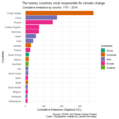
As the image above shows, the US is the country that bears the most historic responsibility for climate change. Yet we simply aren’t doing enough to tackle the problem. Domestically, for example, US subsidies for oil and gas production remain in place, squandering national resources and stalling the global energy transition.
Likewise, internationally, US funding to support developing countries deal with climate change is insufficient: the US has pledged only $5.7 billion in climate finance by 2024, while the EU (which has an economy ¾ the size of the US) provided more than four times that amount ($24.5 billion) in 2019.
As the visualization above illustrates, the process of climate change is well underway. Its impacts will affect us all but will have the most harmful effects on the poorest and most marginalized populations—the people who have done least to create the problem.
It’s time for immediate and aggressive action to turn the tide on the climate crisis; the US contribution to the solution must reflect its outsized contribution to the problem.
TAKE ACTION: Sign your name now and demand that our members of Congress put an end to fossil fuel subsidies.
_____________________________________________
Notes:
- Data is from Berkeley Earth, a non-profit aimed at addressing concerns of skeptics regarding the transparency of the global temperature record.
- Data runs to April 2021.
- This data set is considered “experimental,” and thus includes no error estimate.
- Temperature anomalies are captured on a monthly time-scale. This means that single daily high and low records might get lost in the overall average. Further, to present the data at an annual scale, monthly anomalies are averaged to the annual scale. Thus, in the data visualization, we are looking at years in which an average temperature anomaly presented as a record for that location. This means short-term records (daily, monthly, etc.) could get lost in the averages.
- In order to avoid all points showing a record for the first year, and to prevent records accumulating in the early time period (as there would have been no prior record), a record is defined as either the time when the top 75% (high temperature) or lowest 25% (low temperature) of the data for the location was exceeded, or when the previous high record was broken. The IQR (interquartile range, or middle 50%) period is limited to 1951-1980 as per the anomaly period for the data set.
- Replication of the data visualization can be achieved using the following code: https://gist.github.com/morrisseyj/3f88db1afb4bc2562d3648a523558d0f
- Please notify [email protected] of any errors.