What’s outside the box? Four reasons to think twice
Eye-catching business graphics can help tell a story. But what’s left out of graphics often hints at a more compelling story.
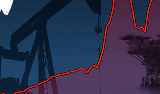
Katherine Stanley ([email protected]), the author, is Oxfam America’s Program Coordinator for the Extractive Industries program. The image above was adapted with permission from a graphic by Gary Kavanaugh (garyridesbikes.blogspot.com).
A picture may paint a thousand words, but even a thousand words may not be enough to tell a complete story. Consider the graphic below. Used in a recent seminar on understanding oil contracts, it is typical of the charts and graphics Oxfam America’s Extractive Industries program sees in its advocacy and policy work.
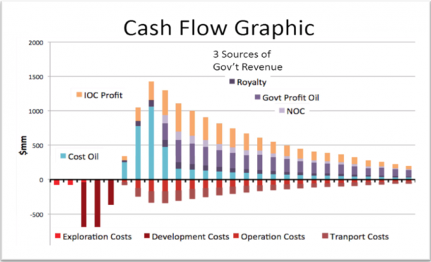
In this case, the graph was used to show how extractives companies bear a high level of financial risk early in a project and provide opportunities for potentially huge revenue streams to developing countries for funding their own development. But there’s something missing. Can you spot it?
1. Stakeholders
Extractive projects are not just a business partnership between the government and a company. The costs the company incurs and the revenues earned also affect communities, people, and individuals living in the areas where projects occur. A bilateral transaction depicted leaves out some of the transaction’s key stakeholders.

This illustrative graph published in Tullow’s corporate responsibility report signals when risks are highest, but also when governments would begin to see revenues.
Source: Tullow, 2013 CR report
2. Externalities
Monetization used in graphics can be deceptive and avoids messy “externalities.” A more realistic graphic begins to involve a far more complex model accounting for environmental degradation, loss of farm land and water contamination, as well as limited job creation and possibly new roads or schools. Tullow has been striving to involve these in their 2014 Annual report.
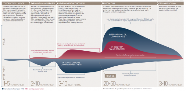
Tullow published this illustrative graph in its 2014 annual report to signal when governments could expect revenues from their oil projects.
Source: Tullow, 2014 Annual Report http://www.tullowoil.com/Media/docs/default-source/3_investors/2014-annual-report/tullow-oil-2014-annual-report-oil-life-cycle.pdf?sfvrsn=2
This graphic is more realistic about acknowledging over-simplification, positive externalities from the project lifecycle, additional stakeholders and time frames for exploration to cash profits. It is a step in the right direction, though it would benefit from more specifics on the effects on the environment and the local community.

3. Expectations
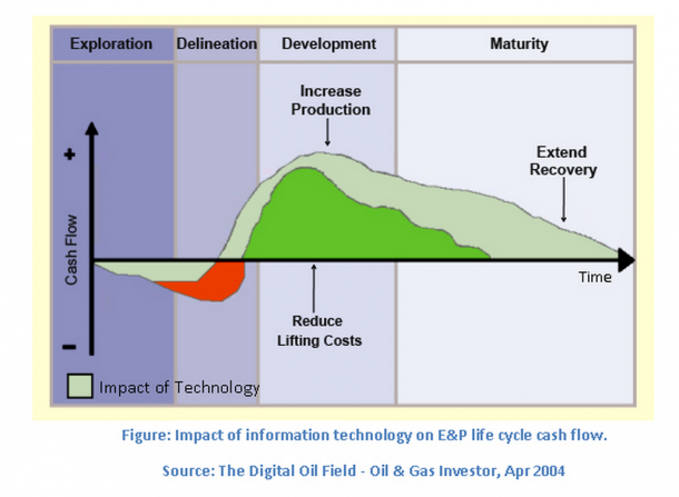
For any graphic, scale is critical to understanding. Scales can easily mislead the magnitude of cash flowing in and out of a project. With an ambiguous currency axis, the expectations of what is realistic for both a company and community stakeholders can be blown out of proportion. Beyond the money, the variability in the timeline of events can also be quite dangerous. As Ghana discovered, the timeline of revenues collection is critical to creating a stable economy and the development outcomes oil production is expected to bring with them. The false expectations raised by poor revenue projections left Ghana without the oil revenues it expected and spent. Analysts’ miscalculations as to when revenues would be received caused the government of Ghana to need a $1billion dollar (USD) loan from the IMF to prevent its economy from tanking.
Source: The Digital Oil Field- Oil & Gas Investor, April 2004 from PetroTel website.
4. Uncertainty
All of these graphics include some level of error or uncertainty. We need to be more humble and acknowledge this wherever and whenever our ‘facts’ are presented.
In the end, we have facts and figures that tell an imperfect story. Economists are trained in supply and demand, cost-benefit analysis, return on investment, but they should also deal with externalities. This post is to highlight our need to stay critical and ask the tough questions that build more accountable relationships between citizens, governments, and the private sector.
How would you better graphically represent the effects of oil, gas and mineral extraction on communities?
Give us your feedback and help Oxfam pull this conversation outside the box!